Embracing Complexity. Craving Simplicity
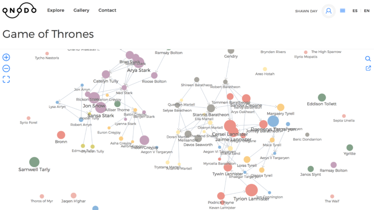
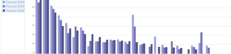
More a caution than a critique, I was fascinated and left to ponder Peter Liu’s time-based spatially informed map presented in the MapBox Blog this week. I think that the concept is absolutely sound and the implementation is skilful, thoughtful…