admin

admin

McInnis on Exagerated Rumours of the Prairie Wheat Rollercoaster

His talk at the University of Guelph Rural Roundtable yesterday, presented a nuanced and revisionary look at the common story that wartime demand drove Canadian farmers to double acreage devoted to wheat as a result rely on it as a dominant crop resulting in a huge blow to GNP when the price of wheat collapsed after the war. ... In this paper, McInnis questions the conclusion that Canada's rapid economic growth during the first decade and a half of the twentieth century rested on western settlement and the 'wheat boom.' ... The commonly held vision of mass migration to the prairies and the subsequent breaking of new land leading to verdant crops of wheat has gone hand in hand with a picture of Canada as the wheat bowl for the Empire during the time of the First World War.

Ah…Mystery!

When I took a look at the three new mysteries I was reminded what a powerful addition to the teaching of Canadian history that this collection is. The new mysteries: "The Redpath Mansion Mystery", "Death on Painted Lake: The Tom Thomson Tragedy," and "Death of a Diplomat: Herbert Norman and the Cold War" keep raising the bar of how to effectively present material using the web. ... With the addition of these new modules, the breadth of the site is reaching a point of critical mass and offer a nicely diverse collection from throughout time and geographic area.

Comparing Word Clouds

Taking a look at a chart of common words and their frequency of use is a first attempt at this. tapor.jpg 
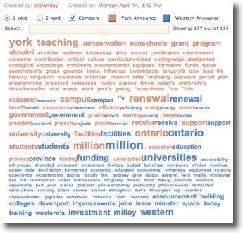
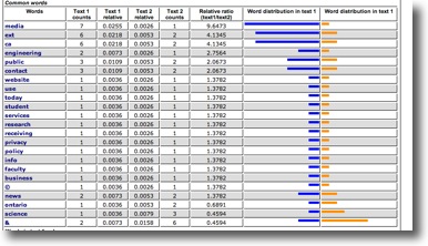
A similar chart was created showing me words that appeared only in one or the another and I was immediately struck by the fact that campus didn't occur at all in the McMaster announcement, where it was the most frequent word at Guelph. ... By choosing to upload only the text of the announcements themselves (And thus help the tool know just what is important to me) I can get the results I want to consider. tapor2.jpg 
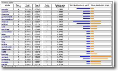
Voila! ... I want to consider this further, but I am far more a visual thinker, and while these bar charts are pleasing, and take a wealth of data and distill it to a very nice summary, I want to take it one step further.

Keeping a Few Social Network Tools in Your Kitbag

However, as I laid out the map, I was in manual mode and although aided by the visual, the growing complexity of the chart suggested that my free-form approach had really skipped the possibility that all this wonderful graph theory that I am vaguely aware of might actually have a role to play. ... The resulting list in DOT looked something like this: digraph unix { node [shape=rectangle, color=orange, style=filled]; "Ulster Unionist Party (UUP) 1921-1972" -> "Unionist Party of Northern Ireland (UPNI) 1974 - 1981" ; "Ulster Unionist Party (UUP) 1921-1972" -> "Alliance Party of Northern Ireland (APNI) 1974 - 1981"; "Ulster Unionist Party (UUP) 1921-1972" -> "Protestant Unionist Party (PUP) 1960s - 1971" ; "Ulster Volunteer Force (UVF) 1966 -" -> "Shankhill Defense Association (SDA) 1969 -" ; "Ulster Loyalist Central Co-ordinating Committee (1974 -)" -> "Ulster Special Constabulary Association (USCA)" ; "Ulster Loyalist Central Co-ordinating Committee (1974 -)" -> "Ulster Volunteer Service Corps (UVSC)" ; } A simple start and as you can see, DOT is not too complex. ... In a perfect world, this would actually be applicable to my dissertation work as well, as opposed to squirreling away a few precious hours of time I should be spending on writing about Canadian tavernkeepers ;-) Hopefully this provides a little bit of insight a to what tools are easily accessible to take relationships and represent them visually - tools which don't demand that you learn the finer points of graph theory, but do in fact allow you leverage them to appreciate the intricacies of large social networks.