
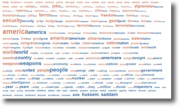
The folks at Many Eyes recently introduced their new cloud comparison tool. Basically, it lets you visualise two fragments of text displaying word frequency for each within the same cloud. It’s an interesting addition to the more familiar word cloud. Using a standard word cloud you get a matrix of words with relative size, weight or colour highlighting frequency in a selected text. This quickly allows you to visually perceive an author or speaker’s emphasis on a particular theme or style of writing or speaking.
With Many Eyes hybrid tool, words which occur in both text are abutted. You can now visually compare two texts from the same author for similar emphasis or quickly determine a difference between texts. In the example presented at Many Eyes, they compare the US presidential State of the Union addresses from 2002 and 2003. In this example, they note the less frequent mention of Afghanistan and the increase in mention of Saddam. Whether this allows one to conclude a change in policy or not, it does demonstrate the use of the tool for provoking questions for further exploration.
On Saturday, the Ontario government officially announced how much funding each university in Ontario is to receive for the maintenance and renewal of facilities. I just happened to see announcements from a few institutions appear simultaneously in my RSS reader and was struck by the rather different ways in which they presented this news.
At McMaster, there was a relatively terse announcement that provided very little detail on how the money would be spent. Western on the other hand had a pretty picture and a complete list of how much was being distributed to each institution. The University of Guelph was more detailed than McMaster and provided very precise details of what the money would be spent on. I was struck by the differences, so I thought I’d see how I might quickly use a text analysis tools to compare the announcements.
I rely on two sources for tools such as these TAPoRWare and ManyEyes. For industrial-strength analysis and fast results, I use TAPoRWare tools. By simply choosing the URLs of the announcements from two universities I receive a wealth of information about the announcements. I am particularly interested in extremes in this case. What makes each announcement similar and what apparent differences are there. Taking a look at a chart of common words and their frequency of use is a first attempt at this.
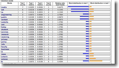
A similar chart was created showing me words that appeared only in one or the another and I was immediately struck by the fact that campus didn’t occur at all in the McMaster announcement, where it was the most frequent word at Guelph. On the other hand, McMaster emphasized engineering and psychology. Yet, neither word occurred in the text of announcements. The reason for this was my use of the web addresses of the announcements, as opposed to the text of the announcements themselves. The TAPoRWare tool analysed all the text on the page and McMaster’s announcement page contained summaries of a variety of other announcements, thus ‘polluting’ my analysis. Thankfully there is an easy way to fix this. By choosing to upload only the text of the announcements themselves (And thus help the tool know just what is important to me) I can get the results I want to consider.
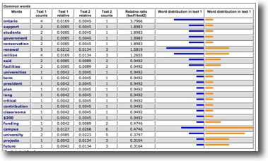
Voila! Now I can see that Guelph emphasizes the future and campus, whereas McMaster emphasizes renewal. Interesting. I want to consider this further, but I am far more a visual thinker, and while these bar charts are pleasing, and take a wealth of data and distill it to a very nice summary, I want to take it one step further. Word clouds are a way of accomplishing this as I mentioned above.
ManyEyes new tool gives me a way to quickly accomplish this comparative analysis. Unfortunately, I can’t just point ME at the web pages and have it capture the text. I had grabbed the text files above to better focus TAPoRWare, and so it was a matter of copy and pasting the text from each of the university web pages and inserting a short comment line between each fragment. Then you simply upload it to Many Eyes by pasting it into a text box, applying some meta-information (a title, source, and description), and clicking the upload button. Once uploaded, you can choose from a variety of available visualization tools. Choosing the word cloud tool immediately presents you with a default cloud display. In this case, Many Eyes noted the fragment dividers and automatically selected the comparison cloud type. I could have overridden this option if the fragment dividers were actually part of the text I was analysing.
The texts that I was analysing are somewhat shorter than the examples that the Many Eyes blog featured and one thing that became apparent was that shorter text may demonstrate a far fewer number of comparable words. Nonetheless, for the ones that are identified, one might be inspired to consider whether lack of emphasis is reflective of institutional priorities. In the word cloud in this post, I compare the announcements from York and Western.
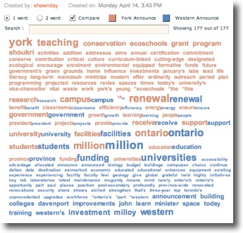
York seems to be emphasizing campus renewal, where Western seems to focus on funding as a concept.
To further refine the analysis, you can also choose word pairs on the display and change the cloud to the most frequent pairs of words. Unfortunately in my samples, campus renewal and facilities renewal are the only two repeated pairs, York favouring both.
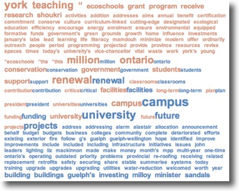
If we consider the announcement from Guelph versus the one from York, the word future features very large in the Guelph announcement. Does this mean they have a vision for the future or that they fear the future? The word York in their own announcement is the single most frequent word, where references to Guelph in theirs is rare. Does this suggest that York University is far more interested in self-promotion? These are the sort of questions that calls for further investigation and underlies the danger of trying to use word clouds on their own. They are all the rage and can be very powerful, but as with any visualization tool, they call for consideration of shortcomings as well as strengths.
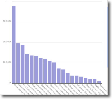
By the way, thanks to Western’s comprehensive list of where all the funding went, it begged creating a bar chart of distribution amongst institutions. Click on the chart below to go to ManyEyes to see it.